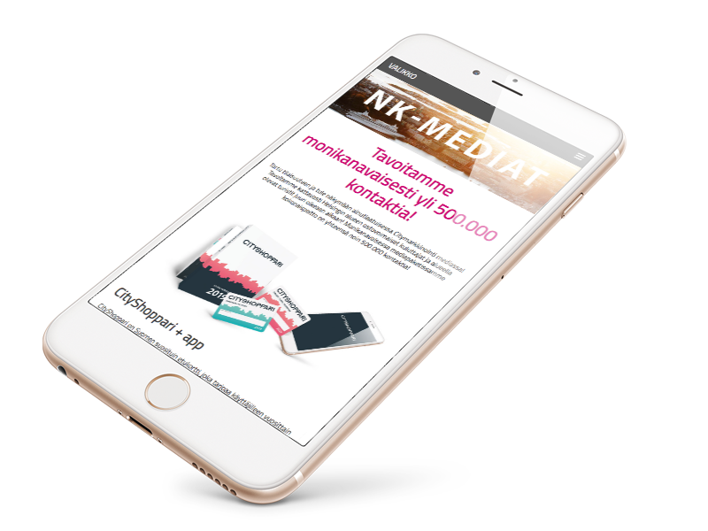
Complete site update
Premise
Well, goal was to build a very simple website with a little corporate touch. Fully responsive of course.
Work
Like always, we go tech first. Meaning that that we use tech limitations to determine what is cost effective, will still look good and most importantly WORKS! For starters I made very simple three page lay-out with Adobe Illustrator. Then gave this lay-out to in-house designer to add the well needed touches.
This was the first project I’d set up by myself, completely solo, with Django/Mezzanine. Pretty much every step needed Stack Overflow time or going through some tutorial. Frustrated with previous project using this CMS I did not use ANY hard coded content in this one. So all content inside body-tag comes from database and can be edited anytime instead of going through the whole release cycle. Groovy.
BUT WAIT THERE’S MORE!
Due to sudden complete re-design I chose to switch to headless WordPress as I am more familiar with it and we needed to have complete control over the website. It’s no secret that Django/Mezzanine has quite steep learning curve and very limited documentation. Also I never really got the release build to work properly.
Client had asked to have full control over the website content, mainly texts and images. For backend I used Advanced Custom Fields and Custom Post Type UI plugins for WordPress, so admin will have almost 100% control over it. There are few navigational elements that can’t be changed via admin. Because front end and back end are completely separated the backend can be installed anywhere, even on another domain. Just access content via WP-REST API. I had practically zero experience with ReactJS so I started again a tutorial and Stack Overflow-cycle. Rinse and repeat. Fortunately I had learned to use SSH with Django so figuring out NPM was quite straight forward.
Going by front end person doing the initial lay-out reduces the amount of time spent trying to figure out what will happen to elements between screen sizes. I truly believe that this approach is the way to go. So, after getting the designs back it took me minimal time to finish off the site. Even with complete re-design.
Fortunately client gave me time to work on this site so finally I had extra time to get started with ReactJS.


