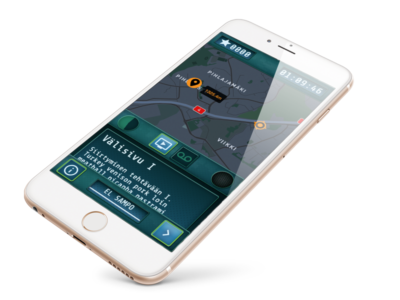
Finally, something ESPECIALLY FUN to do – a completely custom project! This is a game made for an activity park. Goal was to create a game that can be modified to have a look and feel of different theme parks and locations. Also content can be whatever, but solutions to tasks are always the same format. This made things easy for me. My role in this project? I. Did. Everything.
- Multilingual (each mission has it’s own language and content)
- Each mission has separate CSS styling, look and feel can be modified
- Built on WordPress REST-API, using Advanced Custom Fields plugin
- Optimised for hand held devices
- ReactJS
Each game has an individual password, so it can be played only with admin granting access on starting location. Every step is stored to localStorage so page can be refreshed without losing game state. In this particular game base idea was that there’s been some sort of gigantic biohazard and YOU need to save the mankind.
Designs
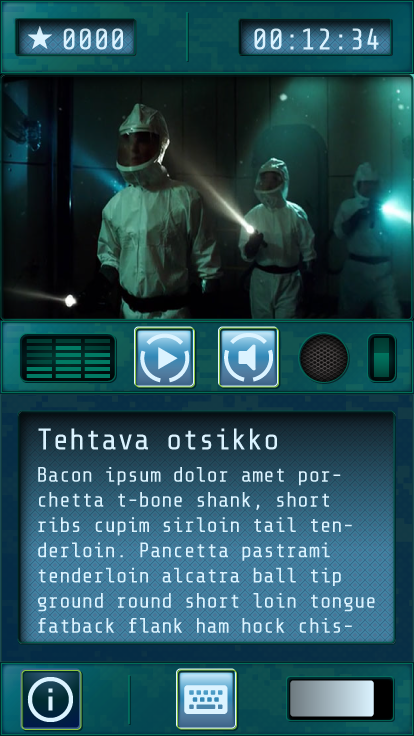
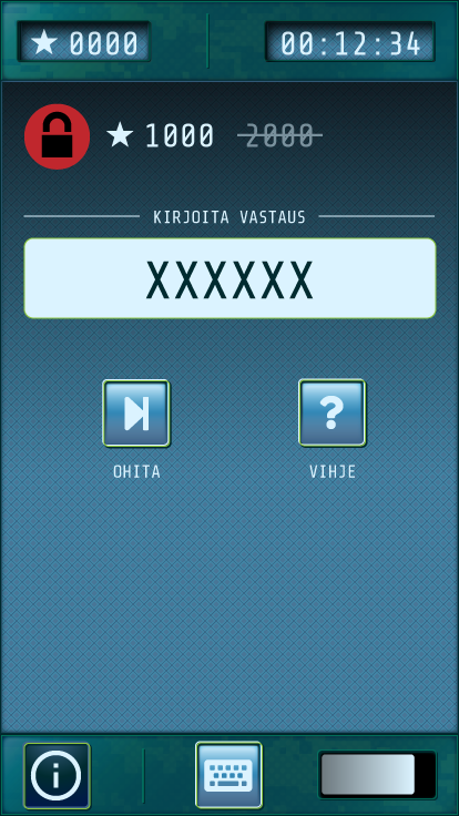
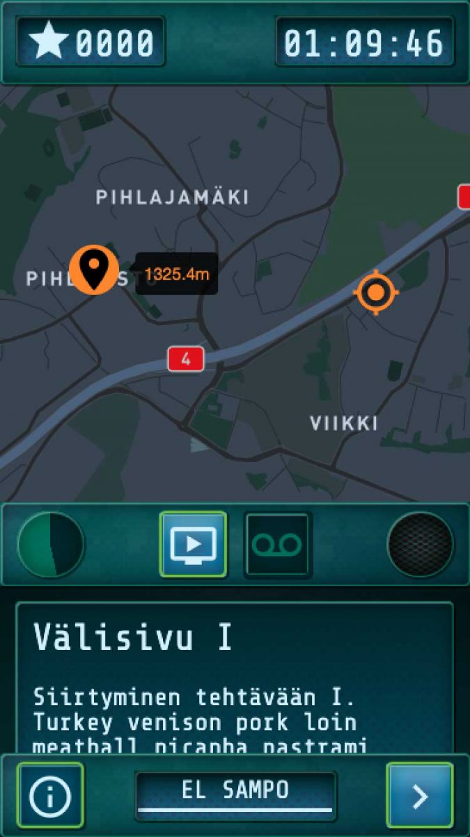
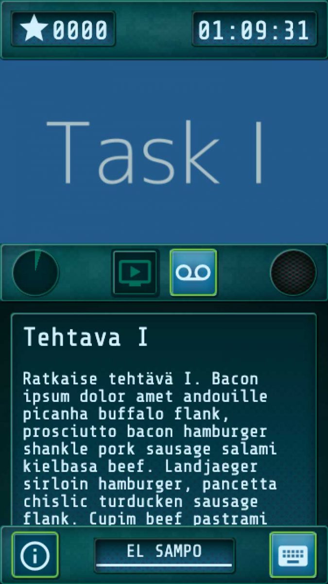
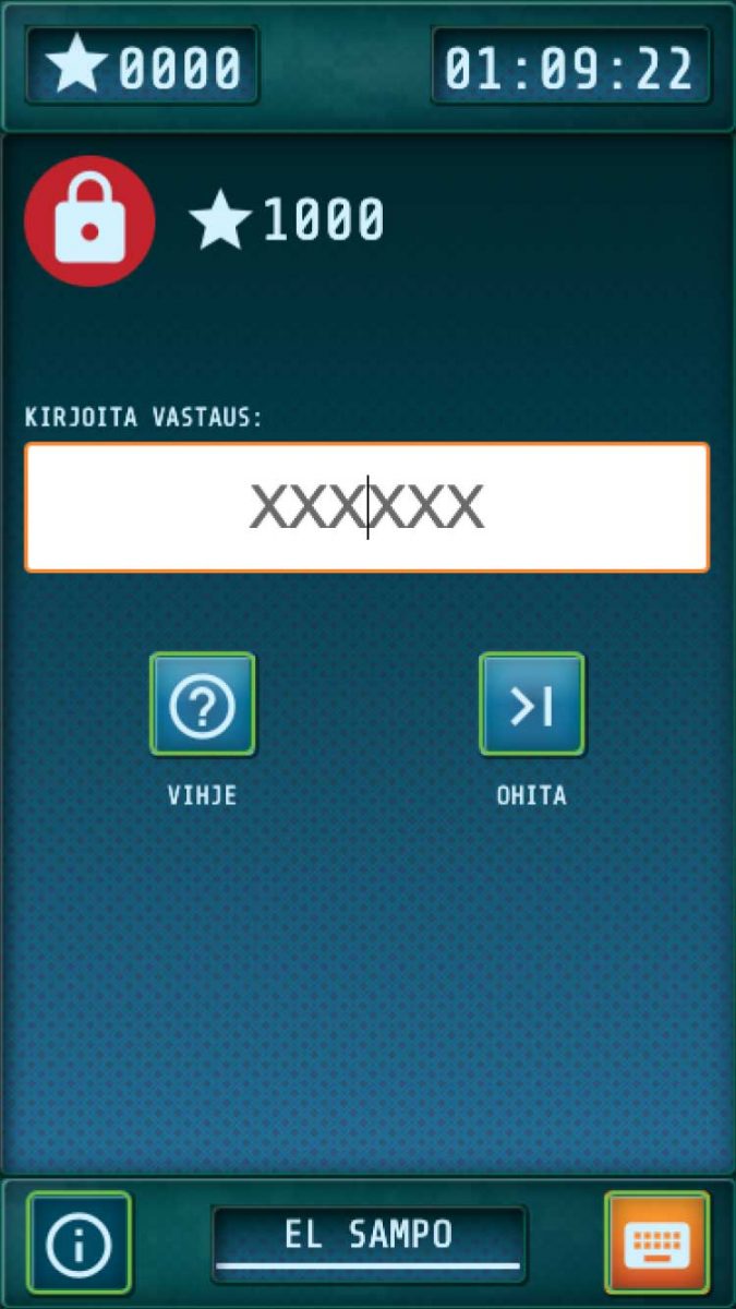
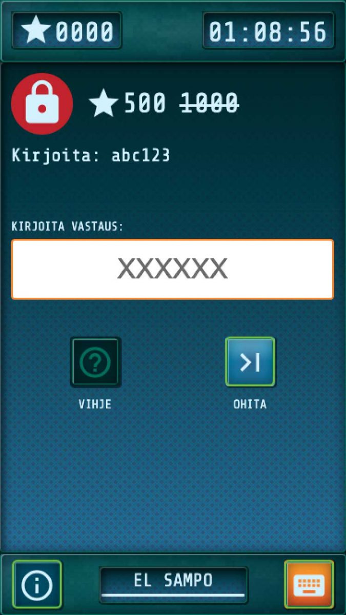
Requirement was to create military style “device” to receive updates from “Head Quarters” in real time. User(s) need to unlock current task to move forward while the clock is ticking. running out of time will cause mission to fail. Colour theme is that light green means interactivity and light bluish are active constantly updating elements. Darker greens are static elements. Each task on the mission can have one image (required), plus additional audio and video.
Initial diagram
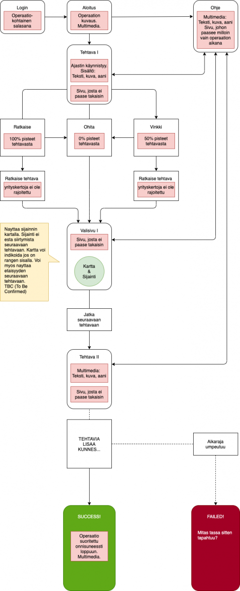
Based on the first discussion I created simplified graphic to give clear breakdown of user flow (Finnish only sorry). This mostly helped me to simplify work progress and have as few components as possible.
Going live
Screenshots of final product with placeholder content. It uses only two background images, everything else is done with S/CSS plus a font library. It is fast and renders nicely on every device. I don’t recall ever writing CSS-styling that hits so closely to original Adobe Illustrator designs. I am using a ton of pseudo elements, multiple backgrounds, gradients, offset borders you name it, it has it all. Although I am not totally happy with Google’s material icons, I think that they look just a pinch crispier than FontAwesome-library.
There’s no link to live game on this one as it is not published yet. And also because it will be password protected and can be only played on location.

